Read Time: 4 minutes
Article Summary:
- I was tasked with creating a dashboard to track cross functional initiatives starting from only a list of objectives and corresponding key results.
- I constructed a relational table and dashboard that enabled my audience to process a multitude of information in a few seconds.
Related Article - My First Internship: Reducing processing time by 75%
In this story, I will describe
- My Role at the Credit Union
- Building the Objectives and Key Results Dashboard
- What I Would Do Differently
- What I Learned
My Role at the Credit Union
Navy Federal Credit Union is the world’s largest credit union with 11.2M+ members and $153B+ in total assets as of 2022. The credit union exclusively serves military members and their families.
Over the summer of 2021, I worked remotely as a Summer Intern on the Real Estate Lending (REL) Strategic Planning & Analytics team which provided key insights to mortgage loan processing and servicing operations. This team was part of the larger REL Innovation division, made up of 5 business units (Strategy & Innovation, Workforce Optimization, Finance, Project & Portfolio Management, and Tech Systems) and about 300 employees dedicated to determining the future of the organization’s overall REL department (4500+ employees) with a commitment to enhancing the member experience.
Building the Objectives and Key Results Dashboard
What are Objectives and Key Results?
Objectives and Key Results (OKRs) are used to set and track progress towards goals. They follow the basic structure of
I will achieve [objective] as measured by [key result].
I frequently use the acronym Key Performance Indicator (KPI) in place of OKRs because KPI is a more common term. However, there are subtle differences. While KPIs typically record the impact of an initiative, OKRs measure an initiative’s level of completion; KPIs focus on results, while OKRs focus on progress. Also, an objective can have several key results.
Here’s an example of an OKR written by Asana:
   Objective: Launch major product initiative by end of quarter

             Key Result 1: Recommendation score of 8 or above
             Key Result 2: 40% of monthly active users use the new feature
             Key Result 3: Increase sign-up-to- conversion rate from 15% to 25%
OKRs in REL Innovation
For my summer internship, I was tasked with creating a Microsoft PowerBI dashboard that visualized the upcoming quarter’s OKRs for REL Innovation. However, unlike the examples given in the previous section, REL Innovation’s key results were phrases that could include multiple metrics and even require qualitative information.
The following uses the previous example to illustrate how REL Innovation’s OKRs could vary within each objective:
   Key Result 1: Recommendation score of 8 or above and Customer Satisfaction score
                 of 9 or above
   Key Result 2: Roll out new feature (Y/N?)
   Key Result 3: Generate positive feedback on new sign-up procedures and increase
                 sign-up-to-conversion rate from 15% to 25%.
As you can see, the variation between these key results made it difficult to organize them in a relational table: KR1 has 2 metrics, KR 2 is binary, the first part of KR2 could be a binary but is too ambiguous to measure without some qualitative information and the second part is a numeric metric that requires the sign-up-to-conversion baseline, actual, and goal rate. The data must be organized in a relational table for it to be used in PowerBI.
The other major challenge was that the key results did not exist in any of the company’s databases. All metrics had to be manually collected from employees. Some individual metrics even required consultations with employees from different business units. The was a lot of uncertainty around who had access to what information and how these metrics could be calculated.
Creating the Dashboard
While I took a more observatory role for the requirements gathering and metric definition part of the process, I took ownership over configuring the spreadsheet/relational table and building the dashboard itself with my mentor advising me.
I first determined that the dashboard needed to display the objective description, the key result description, a Yes/No flag indicating whether the key result had been achieved yet, a comment section, and a chart juxtaposing the current state of the metric and the goal metric.

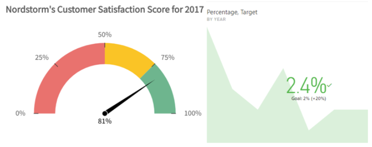
Several different types of charts were required because each metric had a different business context. Different charts have different data needs. For example, the gage above on the left requires minimum, maximum, actual, and goal number. The KPI card on the right only requires an actual and goal/baseline number. The primary obstacle I faced was organizing all this data in a valid relational table and constructing a clear story.
The Relational Table
The relational table is the data source for the OKR dashboard. For this project, the relational table is a static flat file housed in Excel. Employees enter data on a separate more user-friendly tab, then the data is automatically transferred to the relational table using cell references.
The table must be relational, meaning that columns must represent fields and rows must represent individual instances, for PowerBI to understand the data. This was difficult due to the variation among key results and the different charts needed to visualize them.
Here is the basic structure of the relational table I came up with illustrated by our updated Asana example:

The columns highlighted in BLUE are populated by functions. Column C, ’Accomplished Qualitative?’, references a Yes/No drop-down list on the employee-input tab. The Column E, ‘Status’, nests various IF(), AND(), OR() and ISBLANK() functions to test whether all aspects of a key result have been achieved. The ISBLANK() function takes into account that some key results don’t have both qualitative and quantitative measures.
The columns highlighted in ORANGE reference cells in the employee-input tab and are used as arguments in Column D, ‘Accomplished Quantitative?’, where employee inputs are tested against goal columns.
The Outcome

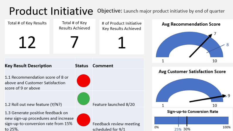
Above is a very rough mockup made in PowerPoint to give you an idea of what 1 tab of final OKR dashboard looked like. I spent a lot of my time going back and forth between PowerBI and Excel, updating and rearranging the relational table as I discovered additional data needs in PowerBI. I think the trial-and-error learning curve gave me a more in-depth and problem-solving oriented understanding of relational tables, data visualization, and DAX than any academic courses.
While the layout is very simplistic, creating the dashboard from only the written OKRs was an extensive process. I like how the dashboard clearly tells you whether the key result has been achieved or not, relevant qualitative information, and the level of progress in the form of a visualization without cluttering the dashboard. The dashboard allows the brain to understand a ton of information within a few seconds.
I am very grateful to REL’s Strategic Planning & Analytics team for creating this task for me, customizing it to my learning goals, and supporting me throughout the summer. At the of the summer, I presented the dashboard to VP of REL Innovation (Nov. 2020 – Mar. 2022) Pete Amstutz and AVP of Workforce Optimization Lou Tungol!
What I Would Do Differently
At the end of my presentation, Amstutz asked me,
“How would you build on this project?”
“I would set up the dashboard to track future quarterly OKRs and show key results trending over time,” I replied.
To increase the dashboard’s longevity, I would remove the minimum, maximum, baseline, and goal columns from the Excel file and create measures in PowerBI instead. This would make it easier to change those numbers in future quarters. I would also suggest replacing the employee-input Excel with a form that automatically populates the records in an Excel file. This would make it easier to keep track of historical data.
What I Learned
Technical Skills
- Relational Databases
- Data Visualization in PowerBI
- Data Analysis Expression (DAX)
- KPI/OKR Dashboards
- Requirements Gathering
- Intro to SQL Server
Lessons Learned
“There can be several ‘correct’ ways to define a KPI or key result. Finding the most accurate KPI definition requires Business Context.”
→ One of the most effective ways to strengthen your critical thinking skills is through trial-and-error.
→ There can be several “correct” ways to define a KPI or key result. Finding the most accurate KPI definition requires Business Context.
→ Understanding how to solve problems is more important than fluency in a large number of coding languages or software. New languages and software are easier to learn when you know how to solve the given problem.
I thoroughly enjoyed my experience at Navy Federal Credit Union and decided to return to the organization as an intern for summer and fall 2022!
